Principles of Design- the formwork for artwork
Those theoretical topics we had learnt long ago- yes, the contrast, hierarchy, proximity- they are important in creating any type of 2-dimensional or 3 dimensional design- be it a graphical art or the façade of a building or even a niche in a wall, they come up everywhere.
Here we look at them once again, and how they create a lasting impression through their visual qualities.
Alignment- The arrangement of elements to create a cluster-free look is alignment. They should not be placed randomly.

Photo by Mehdi Sepehri on Unsplash
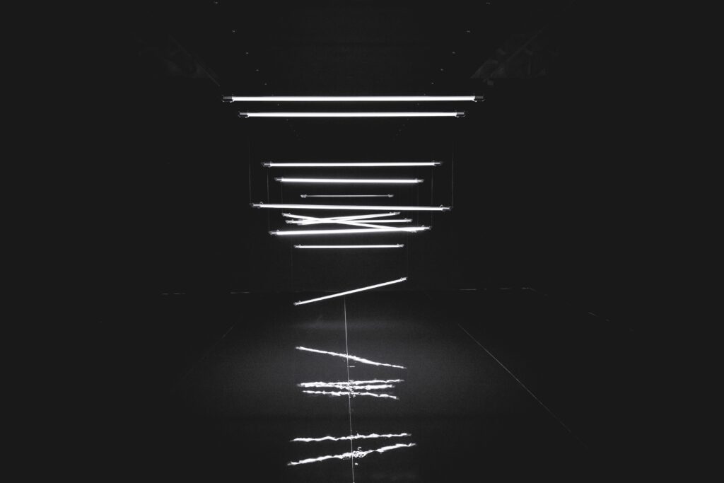
Photo by Danny Howe on Unsplash
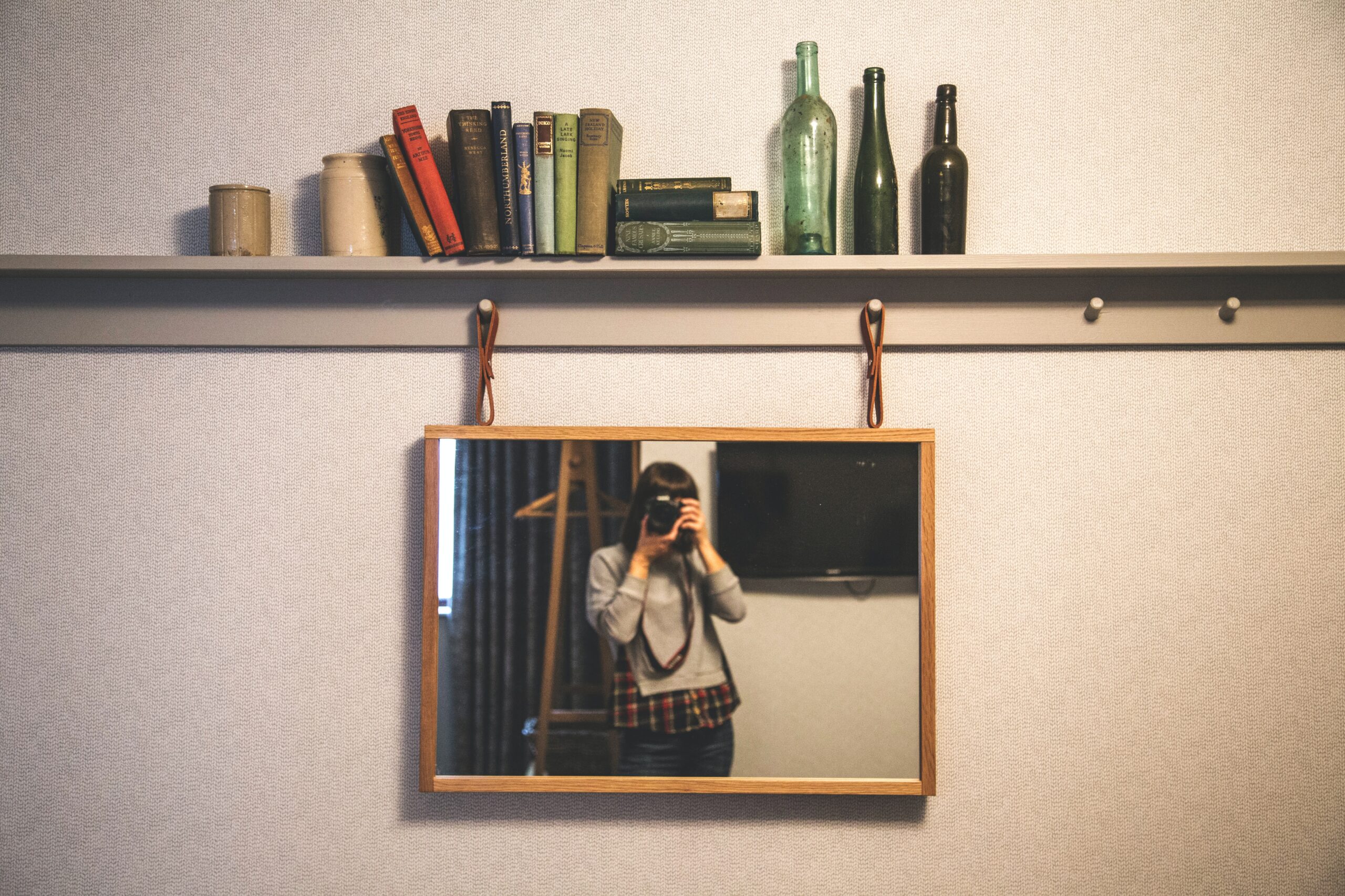
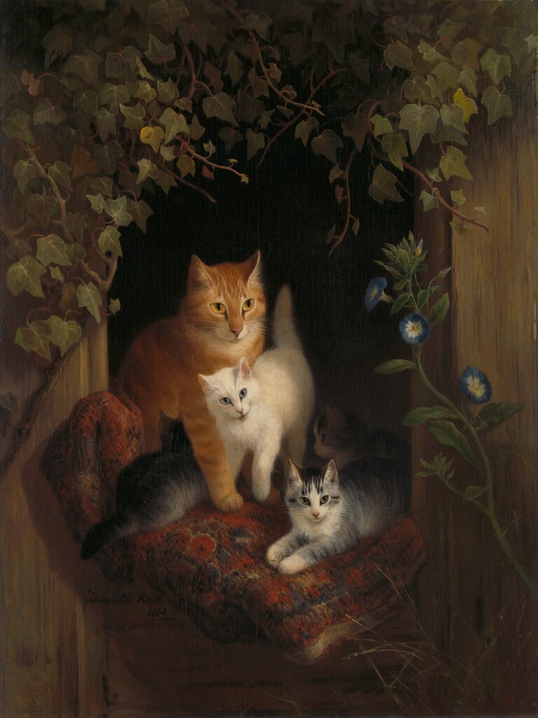
Hierarchy- Hierarchy dictates the sequence of the user’s eyes by varying the visual weight. The headings, the sub-headings and the text content- all should be appropriately sized, placed and decorated according to their importance.

Photo by Kilian Seiler on Unsplash
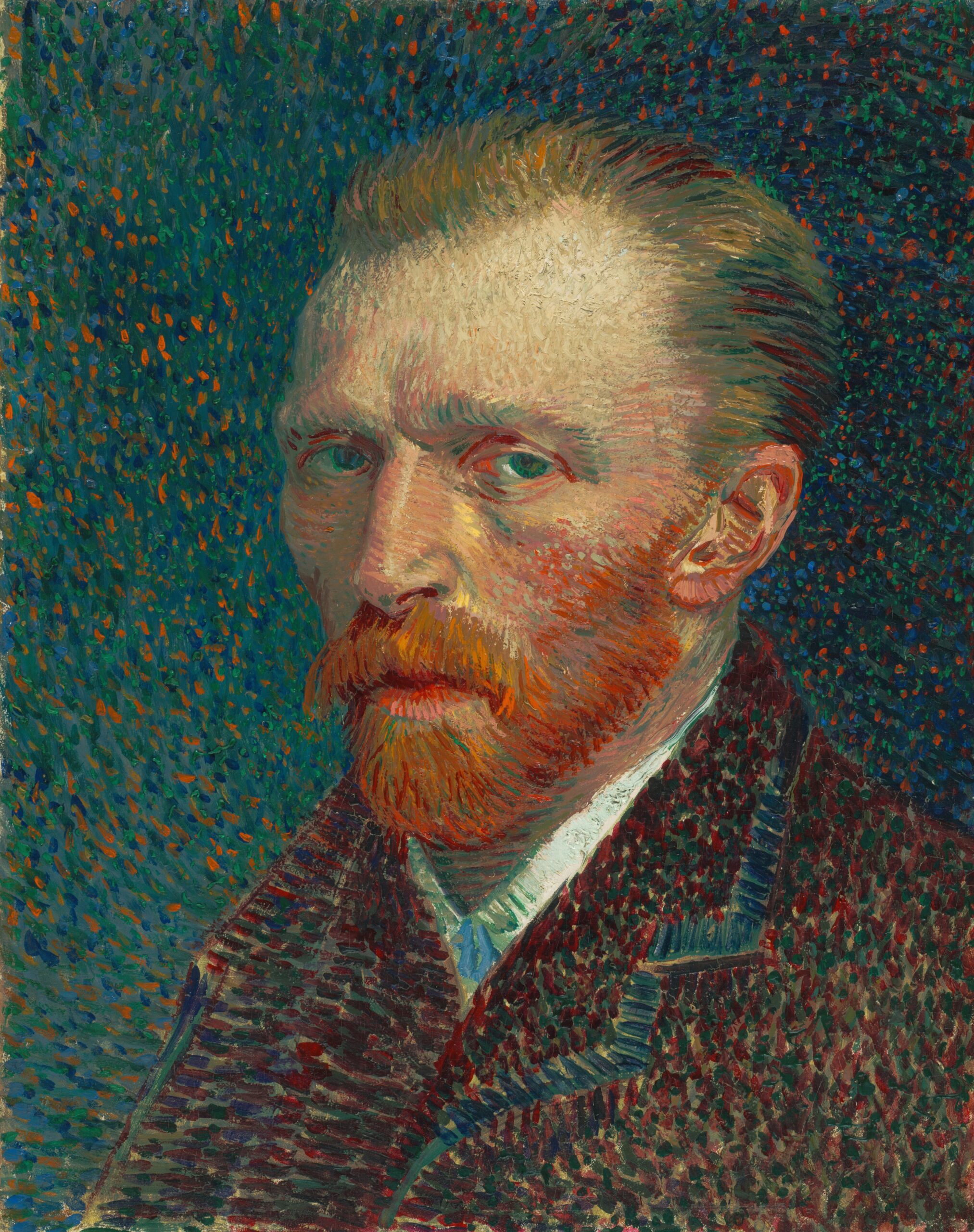
Contrast- Contrast helps highlight the important points first, by focusing the viewer’s attention with the help of bold colors, visual weights and placement.

Photo by Matthew Ball on Unsplash

Photo by Nathan Anderson on Unsplash
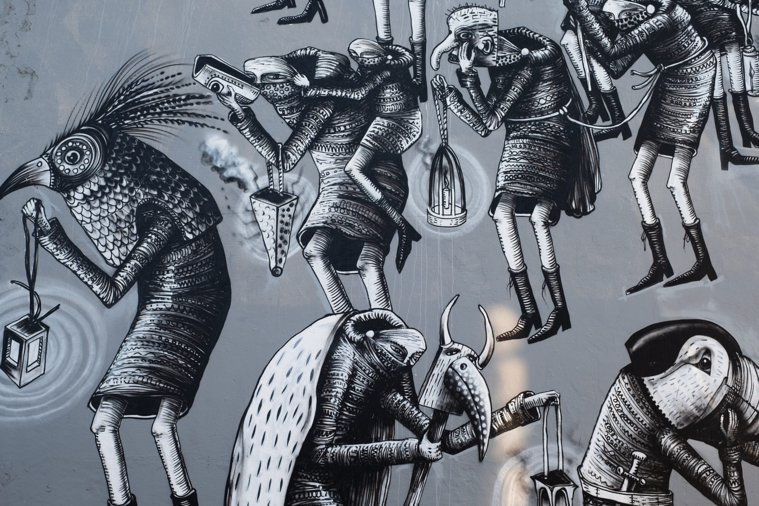
Balance- Weighing the elements either evenly or evenly helps highlight or tone down the design. An unbalanced design is an eye-sore. Balance is also needed in terms of color.

Photo by Birmingham Museums Trust on Unsplash

Photo by Renee Fisher on Unsplash
Repetition- Repeating elements create patterns, adding an aesthetic benefit. The elements which are similar should look similar, so the user knows so.
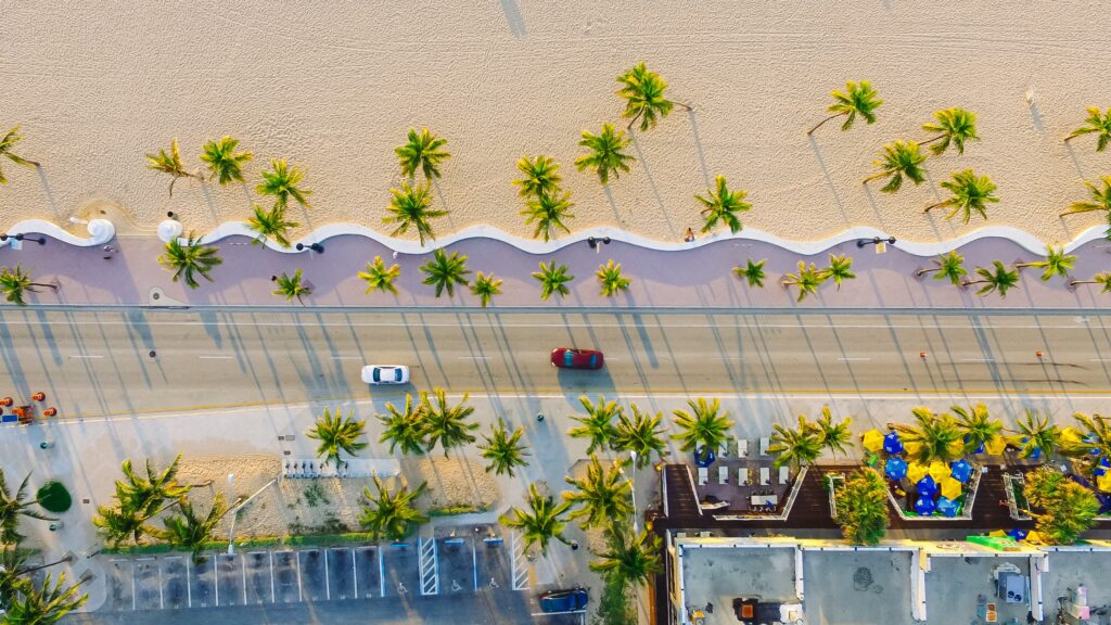
Photo by Lance Asper on Unsplash
Proximity- Clustering together the elements according to their importance works when you can group them. The way the user sees the design depends upon what is close to what, and what will be seen next. The elements close together should be aesthetically complementary- in the terms of font, colors, size, etc.
Color- Using the color theory in practice helps create an impression on the viewer. Complementary colors, monochromatic shades and other color schemes- each have a different effect. Bold colors can be used to create an emphasis while toned down, muted colors can create the calm background to focus on what’s important. The use of colors keeps changing according to the latest trends, sometimes its neon shades, sometimes pastels.
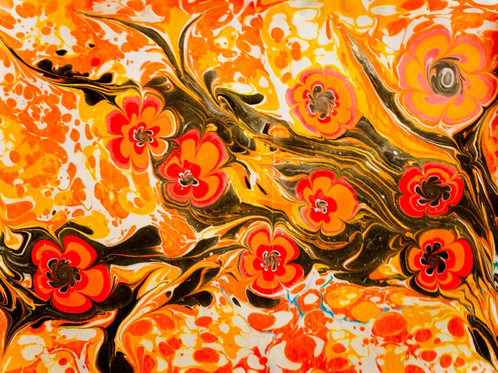
Photo by Raimond Klavins on Unsplash
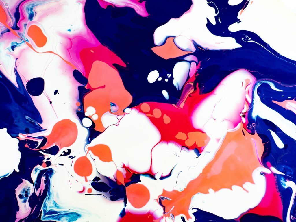
Photo by Dan-Cristian Pădureț on Unsplash
Space- The negative spaces are just as important as the positive elements, they show where to focus on. A design too clustered is overwhelming, while a design too empty fails to create an impression. The spaces should be distributed thoughtfully, to enhance the content.

Photo by Dylan Sauerwein on Unsplash
Featured image- Photo by Lance Anderson on Unsplash